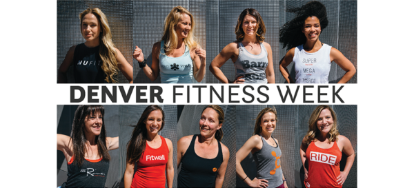
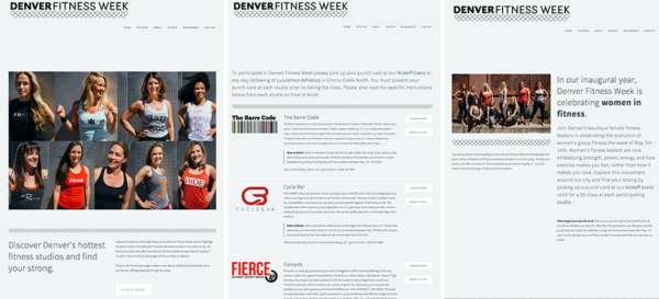
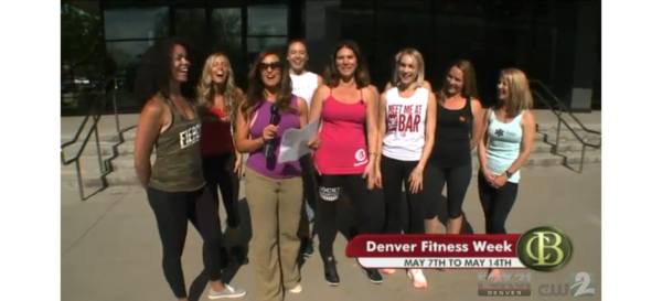
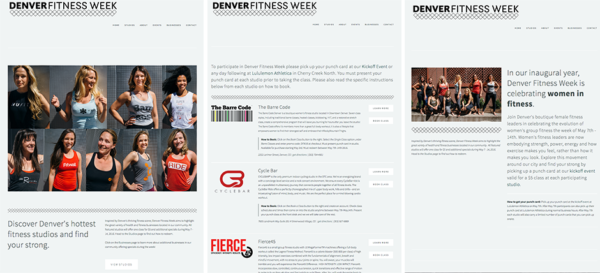

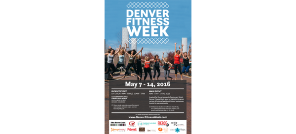
Concept, execution, PR, logo design, branding, and web design for Denver’s first fitness week. See appearance on Colorado’s Best: Denver Fitness Week
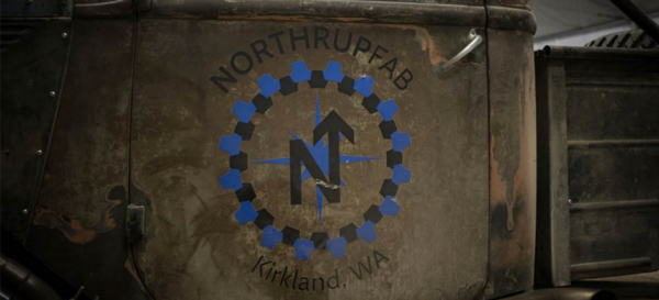


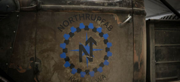
Northrup Fabrications
Logo design and branding for this Seattle based fabrication company. Logo reflects the owner’s last name and geographical location in the Pacific Northwest.
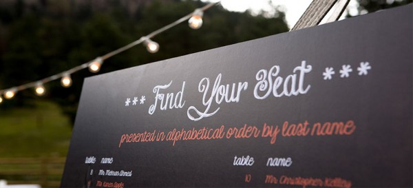
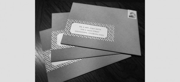

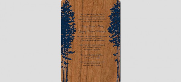


Raven Rock Ranch Wedding
You name it, I did it for this event…including walking down the aisle! A complete suite of invitations were created including a custom logo, inventive address label wraps and formal invitation printed on real cherrywood! The website was customized in […]
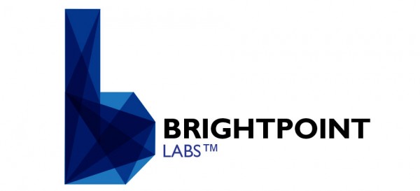
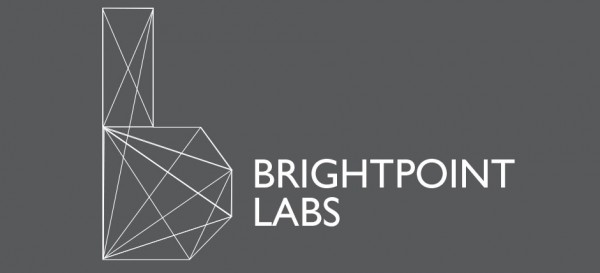
Brightpoint Labs
Brightpoint Labs uses the refraction of lasers against objects to create 3D images. The logo created for Brightpoint plays off this idea by creating prisms and rays of lights within the shape of a “b”. The logo for Brightpoint was […]
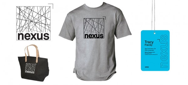

NEXUS
Nexus is a career development forum for young professionals. The forum is designed to help young staff find the right path to develop their career as well as meet other young professionals in their industry. The logo was developed to […]
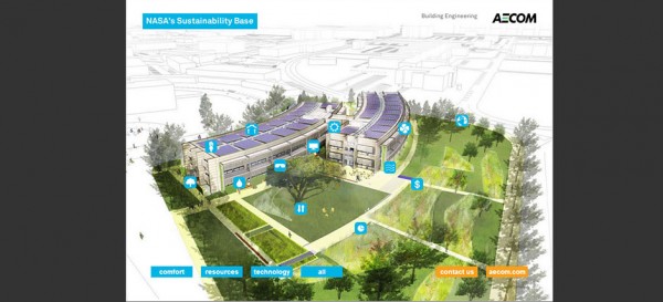
Sustainability Base
An interactive, yet simple website was needed to highlight the functionality of a high-performance building designed for NASA. The website was created in html with icons that you can filter to view the different functions of the building. Provided UX […]
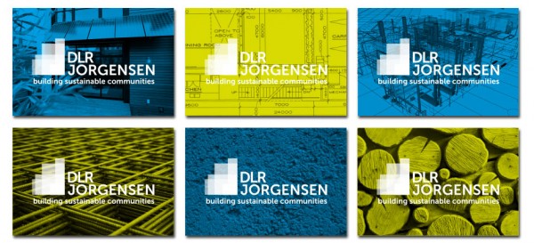
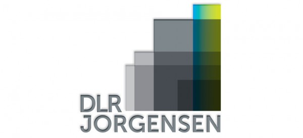
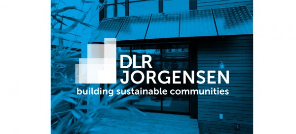
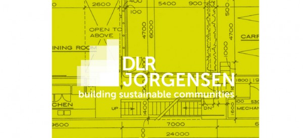
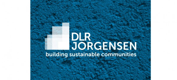
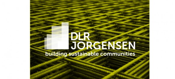
DLR Jorgensen
DLR Jorgensen is a construction firm specializing in sustainable building for commercial as well as residential facilities. The logo depicts building blocks as well as a block highlighted in a gradient to symbolize the company’s minority owned business status. As […]
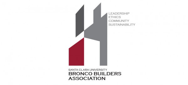
Santa Clara University Bronco Builders Association
The Bronco Builders Association at Santa Clara University in California needed a logo that looked fresh, modern and fit the industry. The result was a geometric shape that forms a building playing off the negative space.
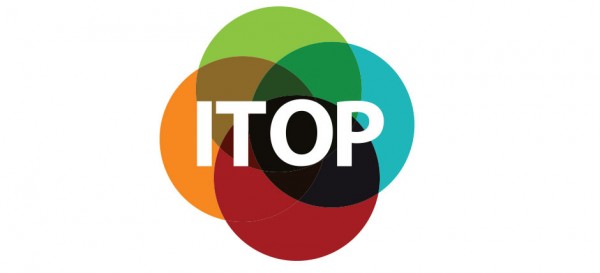
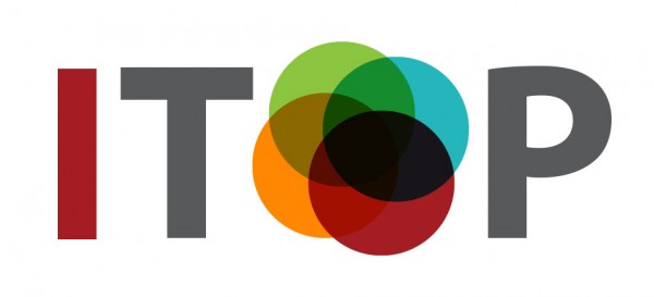
Stanford University ITOP Logo
The Office of Development at Stanford University in California needed to brand their new performance management program before a major roll out. The goal of this branding exercise was to foster enthusiasm for the initiative and captures the underlying focus […]
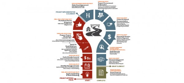
State of Colorado, FEMA Public Assistance
The State of Colorado developed a Project Management Office (PMO) to respond to the widespread flooding that occurred in Colorado in late summer 2013. This office was tasked to organize and communicate various efforts to help the State along the […]
12